Mrinalini Luthra, pre-PhD fellow at CREATE led an interactive session in the bachelor course Archives, Information and Society taught by Dr Michael Karabinos.
: )
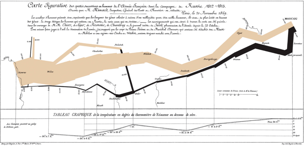
Data visualisation as visual story telling — a balance between form and function — was discussed through various examples of data visualisation. For instance “Napolean’s Russian Campaign” by Charles Joseph Minard (image shown to the left) was analysed in detail. Data visualisation tools were introduced during the interactive session to visualise an archive. Students then chose an archive of their choice and created fascinating data visualisations with an explanation of the problem they were trying to address. A few of the visualisations can be seen below:
: )
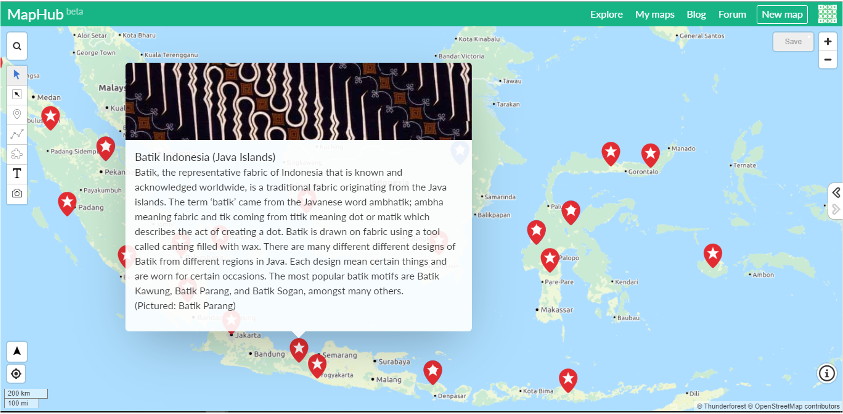
Adinda Remalya | Media and Information,
proposed an interactive map visualisation to present Indonesia’s traditional textiles.
She chose the KemDikBud’s (Ministry of Education and Culture) collection of Indonesian textile and proposed an interactive map as a solution to consolidate and present this rich cultural heritage of the various Indonesian islands.
jjjjj
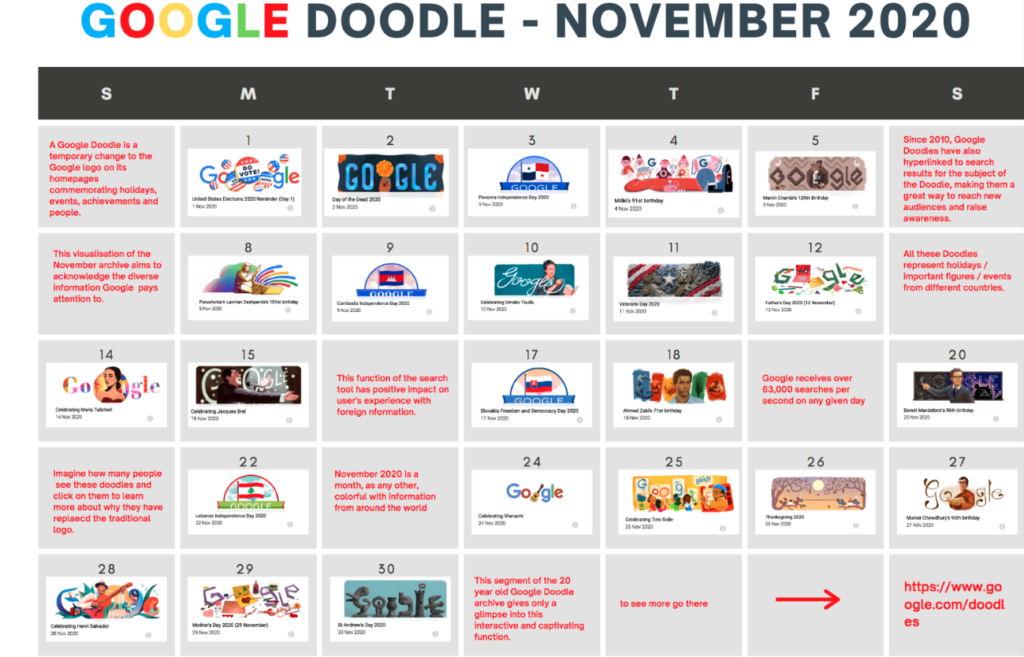
Daniell Tahor | New Media and Digital Culture
created a visualisation exploring the effects of the Google Doodle on culture.
Daniell explored Google Doodle as her archive — a feature that commemorates holidays, achievements, people and events itself as a calendar visualisation. With a balance between image and text, the visualisation explores the effects of Google Doodle on informing and shaping culture.